Task 1 - Structures and techniques in television advertisment
| advertising.docx |
Advertising
Advertising is a way in which companies sell their products to a mass market. Both catchy and sometimes sad, advertising is a powerful tool used by companies to get their products out to consumers. However, this can be confused with promotion because they do both aim to bring attention to companies and new products. The difference between the two however, is that advertising is aimed to sell a product to consumers; whereas promotion is used to bring attention to certain in-store/company offers or deals 1.
If you look at any advert on television or in a magazine, there is a high chance that the adverts has used several common conventions that are used to help sell product to the consumers. Gender is perhaps the most used tactic to sell. Specific adverts are aimed at either men or women; however there have been numerous adverts that have been criticized for being sexist. 'Lynx' have come under fire on several occasions with their adverts being deemed sexist by numerous people. The depiction of women chasing after men one they have used the deodorant has been seen as the company telling consumers that women will fall for you as soon as they use the product2. Even the description used to sell the product has been criticized for using certain words such as 'seductive' and 'magnetic' referring to he products effects on people3.
Following on from the sexist controversy found in 'Lynx' adverts, there have been many other adverts that have been criticized for being overly sexual and/or full of innuendos. The common truth is that sex sells. Adverts use imagery, sound effects and sometimes even colors that are easily associated with sex because it mirrors pleasure4. While some adverts like 'Galaxy' alludes to sexual pleasure, it is not so obvious as the adverts below.
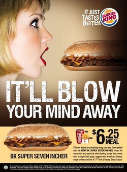
The 'Burger King' print advert that ran in Singapore was quickly pulled for being obviously and explicitly sexual5. The female who appears is obviously meant to look like a blow up sex doll and the phrasing used to describe the product is again obviously suggesting sexual acts.
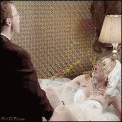
'Skittles' released a notoriously famous advert, which again was quickly banned, but became a viral hit on YouTube, that depicted a couple obviously engaging in sex. Following the advert the slogan 'Taste the Rainbow' appears which paired with the events depicted in the advert, is a too obvious innuendo resulting in it being quickly banned 6.
Both of these adverts show how both print and television adverts can cause controversy. Although the Skittles advert would air after watershed, the print piece could be seen all around at all times and by anyone, meaning that the people in charge of advertising it should take into consideration the younger consumers who might see it. Although many young people wouldn’t understand the innuendo, it is still to sexually graphic to be shown. Both adverts show how serious censorship is taken when it comes to advertisement, especially when certain adverts can be seen by all ages at anytime.
References
1. http://www.wisegeek.org/what-is-the-difference-between-advertising-and-promotion.htm
2. http://www.theguardian.com/world/2006/jul/09/paulharris.theobserver
3. http://www.bwss.org/how-lynx-products-are-sexist-and-degrading-towards-women/
4. http://advertising.about.com/od/advertisingprojects/a/Sex-In-Advertising.htm
5.http://www.pinterest.com/pin/420453315181331526/
6. http://www.gifbay.com/gif/banned_skittles_commercial-22880/
| ambi_pur_advert.docx |
Ambi Pur Advert
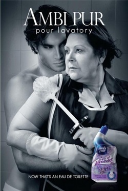
The print advertisement for ‘Ambi Purs’[1] new Lavender bleach is both comical and a parody of established perfume advertisements. There are a number of conventions used in this advert that can be seen in other ads but that is the point of it. It is supposed to have the look of a perfume ad but have enough of its own techniques that it is it’s own advert and not a direct copy of another brand.
The colour scheme used in the advert is greyscale. The grey colour adds a dramatic feel to it, which mirrors the position and expressions seen on the models faces. The colour scale can be seen in perfume ads like ‘BVLGARI – Jasmin Noir’ and ‘Giorgio Armani – Acqua Di Gio’. The ‘Ambi Pur’ ad then does the same as most perfume ads by including a small picture of the actual product that is then in colour, so it catches your eye and you are aware that the product being sold is the perfume/ bleach.
In contrast with perfume ads however, this advert defies the usual models used. Where most adverts use a male and female who are both attractive, fit, tanned, semi-naked and appear confident and desirable. Whereas the ‘Ambi Pur’ advert uses a female model who is the complete opposite. This model is much older than the usual models, not as fit and she is portrayed as a common woman. By having her in a cleaner’s outfit she is seen as working class, which is a fair representation of modern society. However, it could be seen that the advert is actually generalising working class people and saying that women are cleaners and the males are successful, which then borders sexism. All three of the ‘Ambi Pur’ ads portray the same woman with the same male while she is cleaning up and the two are seen in sexually implied and/or dynamic positions which enforces the idea that sex sells products.
[1] http://www.bitterwallet.com/commerical-break-ambi-pur-own-perfume-ads/71419
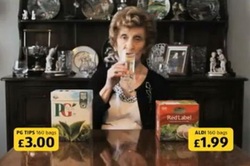
This ‘Aldi’ advert is a comical take on comparison advertisements. All comparison advertisements play on the fact that their store is the best-priced store for a particular product. ‘Tesco’ uses baskets to symbolise how much you can buy from their store in comparison to competing stores, where as this ‘Aldi’ is more simplistic and does not try to push their store on audience. The advert simply has two products, a well known branded product and a less known brand sold in the ‘Aldi’ store. The price then comes up in yellow, a bright enough colours to catch audience’s attention.
The overall message of the advert is ‘Why pay more for the same product?’ The older lady featured in the ad has a neutral and almost un-bothered look on her face, mirroring the idea that people shouldn’t be bothered about brand and that price is more important. However, using the older lady in the advert could be seen as stereotyping older people to be drinking tea a lot, although the overall message about spending more on the same thing is more prominent than supposed stereotyping.
The overall message of the advert is ‘Why pay more for the same product?’ The older lady featured in the ad has a neutral and almost un-bothered look on her face, mirroring the idea that people shouldn’t be bothered about brand and that price is more important. However, using the older lady in the advert could be seen as stereotyping older people to be drinking tea a lot, although the overall message about spending more on the same thing is more prominent than supposed stereotyping.
|
| ||||
Coca Cola: #ReasonsToBelieve and Lynx Make Peace Not War
Coca Cola ran a family friendly advert campaign called ‘#Reasons to Believe’ in late 2013. According to the Coca Cola website, the idea of the advert is to inspire belief of a better world and ‘promote(s) optimism and happiness’[1]
The campaign features a choir of children singing a rendition of ‘You Got the Love’ by Candi Stanton, later covered by Florence and the Machine. While the choir sings the song, there are numerous clips depicting acts of negativity like crime, war and more comedically, Monday mornings. After each ‘act’ of negativity, there is a clip showing a contrast. For example, ‘For every display of hatred…’ shows a group of teenagers in riots, the following clip shows a gay couple getting married with all the family cheering, with the caption ‘… there are 5000 celebrations of love’.
The final positive act shown is a group of friends drinking a bottle of Coke. Before the final clip, there is not hint throughout that Coca-Cola is being sold to audiences and the final inclusion of it not only tells audiences that but promotes the idea that with Coca-Cola comes happiness.
The drastic contrasting clips showing love, hate, embarrassment and humour combine together to make both a funny and serious advert designed to inspire happiness for everyone.
Similarly with the Coca-Cola advert, in early 2014, Lynx launched an advert called ‘Make Peace Not War’ just in time for the Superbowl in February. The advert shows several countries about to engaging in a war. For example, an Asian family are given a silver case with a large red button in it which is about to be pressed, a country (depicted as North Korea) featuring hundreds of people standing before their leader, a soldier landing in ageing presumably, Vietnam and a tank driving through a destroyed city to then stop infront of a woman who just stands there.
The advert builds up tensions through most of the advert as audiences are expecting the worst to happen. Them in the final moments the exact opposite happens to what is expected. The Asian family launch fireworks to celebrate their love, the Korean country has all the people lifting tiles while form a picture of the leader and his wife inside a love heart, the soldier in Vietnam embraces his wife and a man gets out of the tank who turns out to be the woman’s husband and they hug. The words ‘Make Love. Not War’ are spoken and appear on the screen followed by the product being used and ‘New Lynx Peace – Supporting Peace One Day’.
The advert was considered unusual for Lynx, as most of their adverts are overly sexual and considered sexist to women [2]. But it was seen and taken positively as when the advert first aired, there were troubles and worries in the Ukraine and Russia.
Both the Lynx and Coca-Cola adverts promote happiness and peace. Where Coca-Cola uses a combination of found footage and staged footage (singing choir and Coke drinking) the Lynx advert used all staged footage. Although the Lynx advert is still powerful, the use of found footage in Coca-Cola makes more of an impact because it is really happening around the world.
The use of spoken words in the Lynx advert makes it seem more personal than the Coca-Cola advert however. The use of speech is way of aiming the advert directly at the viewer but the viewer could be anywhere in the world, something that the Coca-Cola advert doesn’t. Although the Coca-Cola advert is comprised of clips that do affect everyone, the clips used were actually comprised of ‘issues (that) matter to UK consumers’ [3], whereas the issues seen in the Lynx advert are directed at the entire world.
Both adverts are important and relevant to modern society. The issues seen through out the adverts affect us all and both adverts stand out to other adverts because they are directly commenting on these issues.
[1] http://www.coca-cola.co.uk/press-centre/2013/december/coca-cola-launches-reasons-to-believe.html
[2] http://prexamples.com/2014/01/lynx-axe-release-peace-offering-in-timely-departure-from-usual-sexual-ads/
[3] http://www.coca-cola.co.uk/press-centre/2013/december/coca-cola-launches-reasons-to-believe.html
Go Compare and Compare the Market.com advert comparison
Two adverts that emerged around the same time in 2009 were the 'Go Compare' and 'Compare the Market' adverts. Both are 30 second long comparison adverts in which they sell comparison websites. The adverts are aimed at people 17+ because they are primarily selling car insurance, which wouldn't be useful for younger audiences. However both are suitable for younger audiences.
The 'Go Compare' advert opens with 2 guys standing in a shop called the Coffee Cup. As they drink their coffee, one says suggests that the price of car insurance is too much. As the second man replies with 'Tell me about it' , the now famous 'Go Compare Man' jumps out operatically singing what would become the adverts famous theme tune (though adapted through the following adverts). As all the other customers join in, the advert comically ends with one of the central characters asking how much the guy was being paid, to which the other replies 'He is only a tenner/ tenor'. The tenor joke is aimed at the fact the adverts, mascot almost, is an opera singer.
The 'Compare the Market/Meerkat' advert opens with the main protagonist, a CGI Meerkat dressed like an aristocratic man, who then continues to talk about how people are confusing the websites 'Compare the Meercat' and 'Compare the Market'. Despite the fact the advert is actually advertising cheap car insurance, the actual car insurance is only present for a short time although it is stressed upon and focused upon towards the end oft he advert more. The advert was a huge success and the following adverts follow the main meerkat, named 'Aleksandr Orlov' and his later assistant 'Sergai', as they travel around the world and different locations.
Both adverts are hugely successful both in different ways. 'Go Compare' became famous because of the frequently described as annoying mascot and song. In later adverts the creators of the advert acknowledged this and decided to play on it, having him being made redundant and searching for a job and physicist Stephen Hawkings sending him into a black hole. Whereas the 'Compare the Market' adverts became famous because of the comically animated meerkats, the 'simples' phrase Aleksandr says in each advert and because eventually 'Compare the Market' advert began giving out themed meerkat stuffed toys to those who purchased insurance on credit card through he website.
Each advert uses conventional forms of advertising. A catchy phrase or song is used in both ads, both becoming the most popular aspect of the adverts and appearing in all subsequent adverts. A mascot or spokesman is again used in each, one live action and the other computer generated. By creating popular and featuring the well known mascots, audiences can automatically identify what the adverts is but also it is a common point that people can discuss when talking about them to others.
Other aspects such as lighting and locations different for one key reason; one is live action and the other is animated. The live action advert uses all natural lighting as the coffee shop set has mostly glass walls, letting in sunlight from outside. Whereas the animated adverts uses low lighting, glows from the fire and computer lights meaning that the creators can control all aspects of the lighting inside of the mansion where it is set.
One other common aspect that the adverts share is the color green. Green is commonly associated with money, power and high social status. This is a good example of simple and subtle techniques used by companies to help promote a certain idea within their advert; in these adverts cases it is about money and being better off by saving money.
Both adverts approach the same idea comically and memorably. Despite taking different approaches aesthetically, both of the adverts sell the same product to it's audiences and each have done respectfully well to do so considering the competitive market they are in.
Task 2 - Research and Proposal
| advertising_ideas.docx |
Advertising Ideas
The following ideas are three ideas I have come up with. Each one is for a different product and a different style of advert, however they are all to sell everyday items.
Idea 1- Ice Cream
My first advertising idea is to advertise ice cream. However, instead of it being a light-hearted and humours, it will be a darker. Towards the end of the advert it might seem humorous when the actual product is revealed but it will still be dark. The advert will feature two protagonists who are both preparing to kill one and other for the ice cream. Once the initial murder set up has happened it will cut to them both dead and between them will be the tub of ice cream, followed by the phrase ‘Ice Cream so good, you will kill for it’ It will then cut to black.
Idea 2 - Bin Bags
My second idea is to sell bin bags. Again like idea one it won’t take a light-hearted approach like most household good adverts; instead it will be a black comedy. The advert will feature a stereotypical lazy slob type character sitting in a chair, shouting at the TV and drinking beer. Then a woman will enter carrying an open bin bag. After a second of contemplation she opens the bag and put the man inside. Then it cuts to her dragging the bag out of the house and the phrase ‘Don’t keep trash in the house, bin it’.
Idea 3 - Tights
My final idea is to advertise ladies tights. This advert would be comedic and light-hearted instead of dark like the other 2. The advert would start with a woman sitting in an interrogation room with a policeman. She then talks about her experience in a bank heist. She is then shown a picture of the man in custody but she denies it because he has a beard. She says that he had a pair of tights over his head and that he had no beard. The policeman says it cant be true that ‘No pair of tights could hide such thick hairs’ the lady then continues to lift her leg up onto the table and roll her tights down one leg, revealing herself to be a gorilla. The slogan, ‘Tights so good, it hides the thickest of hairs’.
| proposal.doc |
Proposal
I have decided to film Advertising Idea 1. I have decided to go with this idea because I think it is the most creative and has an interesting story and unique selling point. Although all 3 ideas don’t use conventional storylines for selling the individual products, I think idea one is the most original. Also, the idea for advert 2 may be considered controversial because of the metaphor for ‘trash’ being the male character. Although it is meant to be a darkly funny, some viewers won’t take it that way.
Advertising Idea 1 will feature only 2 characters; a male and female both being the protagonist and antagonist to each other. Over the course of the advert they will both be preparing weapons to kill one and other with in different rooms of the house. The female protagonist will be in the bedroom, kneeling beside the bed. Reaching under the bed, she takes out wooden box and rests it on the bed. She will open it and then take out a handgun. The male protagonist will be standing in the kitchen infront of a block of knives. He then slowly reaches out and pulls out one the butcher knife. Then, on a split screen they will both turn round and leave their respective rooms, holding each weapon behind their backs. Both will then draw their weapons and it will cut to black with the sound of a gunshot firing. The scene to follow will be of the woman sitting on a chair, eating the ice cream with the male character dead on the sofa beside her. Then the phrase ‘Ice Cream so good, you will kill for it’.
The audience for my advert will be both men and women aged 18+. Although ice cream is for all ages, the content and story of the advert is for a mature audiences and a younger audience might get the impression that you can or should kill for ice cream, which the advert does not encourage, just uses as a dark selling technique. The overall length of the advert will only be between 30 seconds and 1 minute long. By keeping the advert short and snappy, it is more memorable to audiences.
Overall I am going to create a short and snappy advert, selling ice cream in the style of a murder. Both the female and male roles won’t play to a stereotype so that there is no bias or sexism that can be used to criticized the advert.
| call_sheet |
Task 4 - Evaluation
Pre-Production
The pre-production process for my advert went well. After conceiving three separate ideas for an advert to film, I went through each idea to see which was the most feasible to film. The biggest decision factor was the set. I had to have access to the location needed and two of them were set in a house, meaning that they were easier to film. The other idea had to be filmed in a police interrogation room and a bank. This advert was not going to be film-able, however I still submitted it as an idea to show creativity and originality. I then decided on advertising idea one as I personally found it both original and also comedic.
I then story boarded the idea. As I knew it was only going to be roughly 30 seconds long, Both protagonists were to be doing the exact same thing in their respective rooms, so I decided that I was going copy the shot types for both. After story boarding the advert, I cast it. I had a close friend who was doing A-Level drama and had been doing drama throughout her school life and she was happy to do it. Then for the male role I was initially going to cast another friend, however a situation occurred when production began, which forced me to change locations. The change in location was not practical in getting the other cast member there so I decided to act it myself.
Production
Production, for the most part, went well. It started off well, managing to get all the shots for the female protagonists scene within 2-3 hours. Knowing in pre-production that the advert would take place in two separate rooms in an average looking house, I could film both scenes on separate days. However, shortly after filming the female protagonists scene, we began re-decorating our kitchen. It was a spur of the moment and quick decision and unfortunately I had no idea it was going to be done while I was in pre-production. So this forced me to change the kitchen location, which wasn't difficult because I was bale to use my dads kitchen. However, this meant that the original male cast member couldn't film at the location because it was 16 miles away.
The change in location didn't pose a big problem as initially thought. I was able to set up and test the shots before filming and I then managed to film the scenes needed within an hour. And then the final scene to film is the 'post murder' in which we both sit together and she eats the ice cream. This is the comedic scene which lets the audience know that what they have watched is nothing serious and with the added advert tagline and image, it makes sense and fits together.
Post- Production
Post - Production initially started out well. Selecting the shots I wanted to use and then placing them into final cut took roughly around an hour and then a further two to cut, place and render the shots. However, the problem came when Final Cut kept crashing, meaning that I had render and save after cutting, replacing or correcting anything I did and rendering the video would take 5 or 10 minutes and it did crash during rendering a couple of times. However after a day it ran fine and I was abel to finish editing it.
After the film has been cut together I placed in the soundtrack and the gun shot sound effect in the correct places and then had to place the ice cream image over the footage. In order to have the image without the white background, I put it into Photoshop and then erased all the bit's that weren't needed. I then re-inserted it into the film and added the text over, completing the advert.
Conclusion
Overall, all 3 processes in this unit went well, not entirely smooth or without fault but they were overcame through simple means. If I were to do this again, I would ensure that all filming locations were definitely free to use. I didn't think to see if the kitchen location was free to use but because it was an unusual and quickly-decided circumstance which prevented me from using it, it was unforeseeable. Editing had minor issues which were overcame also but not as quick, however it did not stop me from editing together my advert. I am happy with final product as it fitted what I had imagined in pre-production and also worked as the tense but ultimately comedic advert I wanted to create from the start.
